

I've tried to make some improvements that should address most annoying issues:
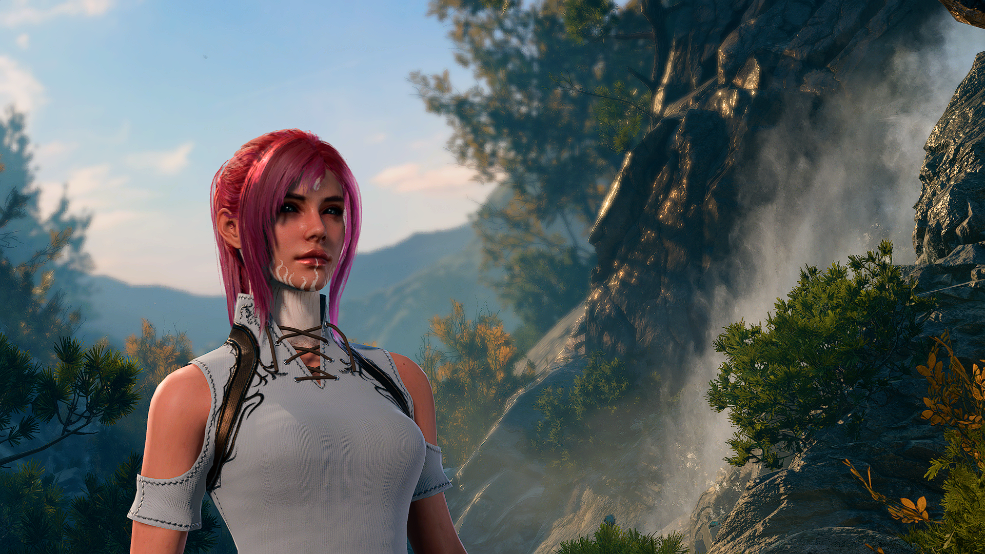
- Paperdoll is slightly (0.9) smaller and aligned to top vertically in party panel. This way character is fully visible, without legs overlapping with data. Zooming-in will also be more natural.
- Whole character sheet is much higher now. Because of that skills and detailed view more often fit the screen and doesn't require you to scroll, plus inventory has 2 more rows.
- Whole panel renders shifted to a new position, where is doesn't overlap sidebar portraits or hotbar and there is enough place for opened Better Containers.
- Notable features and Conditions icon/text and text on Summary got slightly smaller to fit much more of them before scroller appears.
- Equipped slots are bigger and backgrounds brighter now, to make them look more distinguishable from inventory slots. Also AC holder is visually silverish now.
- There is no six.
- Individual panels don't overlap with sidebar and hotbar, as well as its horizontal slider.
- Very literate Gale in pants on screenshots.
- Feats, and class and tadpole features added.
- Versions with 5 and 6 characters on one party panel screen added for 16:9 and UW aspect ratios.
- Good dozen of formatting changes to deal with overlapping and make everything tidy.
Comments (0)
Log in to post a comment.
This thread is open for discussion.
Be the first to leave a community review!